Tuesday, 27 February 2018
Open and Closed Surveys
We will create a survey on surveymonkey, questioning others about our video. These questions will include our star image, what they liked, and how they rated it overall.
It is important to have as little 'closed' answers as possible. This is because it limits the people to what they can say whilst also limiting our feedback, whereas an open question can have as much detail as possible, and give us more specific answers. Therefore, we will only ask one or two closed questions, and the rest will be more open minded and allow the answerer to say what they wish.
Open questions can encourage our audience to write a more detailed response which in turn will enable us to evaluate their feedback and use it to make improvements. Downside of this is that unless we put an age bracket on our questions, if we get any negative responses, we won't know if this is valid as they may not be our target audience.
ReDraft of Front Cover

Feedback:
- Font does not match star image
- Image can be seen as over-edited
- Good colour contrast and representation of star image
- Detail of guitar
DigiPak Draft


Feedback:
-Front cover is too heavy and dark for what a front cover should be like.
-The actual CD may be a bit too plain.
-The contrast in colour of the front and back player may look odd.
Monday, 26 February 2018
Costume
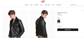
When planning what we wanted Sam to wear, we looked online to see what shops had things available that suited Sam's style. We dressed Sam in this style as it represents his emotions whilst making this album as well as selling his star image of being organic. We looked on h&m and these were the results:


Wednesday, 21 February 2018
Audience Feedback on Website
Positive:
- Relevant Images that portray the correct star image.
- Good manipulation of images on Photoshop
- Good information in the 'About' section gives fans a good insight to the road the artist has been to get to this point.
- Logos of hyperlinks to music downloads makes it relevant to the online age and also expands the range of people that can potentially access the music.
- DigiPak on home section shows a good range of images and thought towards camera shots.
- In the contact section, the image is great
- Quote from big media company advertising new album '5 star' is great.
Improvements:
- Tour venues must be different and all over UK rather than just London
- In the music section, change the picture and add the digipak
- In the news section, the dates are wrong (2023)
- In the about section, change the last paragraph to something more realistic. Upcoming artist, not a big artist yet. The picture for this section is too serious.
Thursday, 8 February 2018
Development of Website 2
We used a website called Wix to create our own website for our artist. We used it in many ways:

We had to delete a couple of page options from the home menu, such as 'gigs'. This was because we already created a 'tour' option, and felt that we only needed one of those two options.

We also had to change the menu bar at the top. This is because it originally clashed with the background image, and therefore it was difficult to see the options. This was done through changing the colour of the words or through changing the design of the bar, and we decided to do the latter.

We decided not to keep the same image as the background for each page, and gave ourselves several different options. This meant we had to take many different pictures and carefully choose which ones went on the website and which didn't. We also edited these images once selected, to make it look more based on our star image.

We chose different scroll effects, as we felt that choosing 'freeze' was more relevant than letting the page scroll down and view the image further. This wasn't necessary as some pages were quite long, and would've exceeded the length of our pictures and therefore may have changed to half the background being black.

We hyperlinked many of our options, to make it more of a realistic website. For example, when you wanted to buy a ticket it would take you to StubHub, or if you wanted to purchase the album it'd take you to iTunes. We felt that this was very necessary in order to make the website the best it could be.
We had to delete a couple of page options from the home menu, such as 'gigs'. This was because we already created a 'tour' option, and felt that we only needed one of those two options.
We also had to change the menu bar at the top. This is because it originally clashed with the background image, and therefore it was difficult to see the options. This was done through changing the colour of the words or through changing the design of the bar, and we decided to do the latter.
We decided not to keep the same image as the background for each page, and gave ourselves several different options. This meant we had to take many different pictures and carefully choose which ones went on the website and which didn't. We also edited these images once selected, to make it look more based on our star image.
We chose different scroll effects, as we felt that choosing 'freeze' was more relevant than letting the page scroll down and view the image further. This wasn't necessary as some pages were quite long, and would've exceeded the length of our pictures and therefore may have changed to half the background being black.
We hyperlinked many of our options, to make it more of a realistic website. For example, when you wanted to buy a ticket it would take you to StubHub, or if you wanted to purchase the album it'd take you to iTunes. We felt that this was very necessary in order to make the website the best it could be.
Subscribe to:
Comments (Atom)